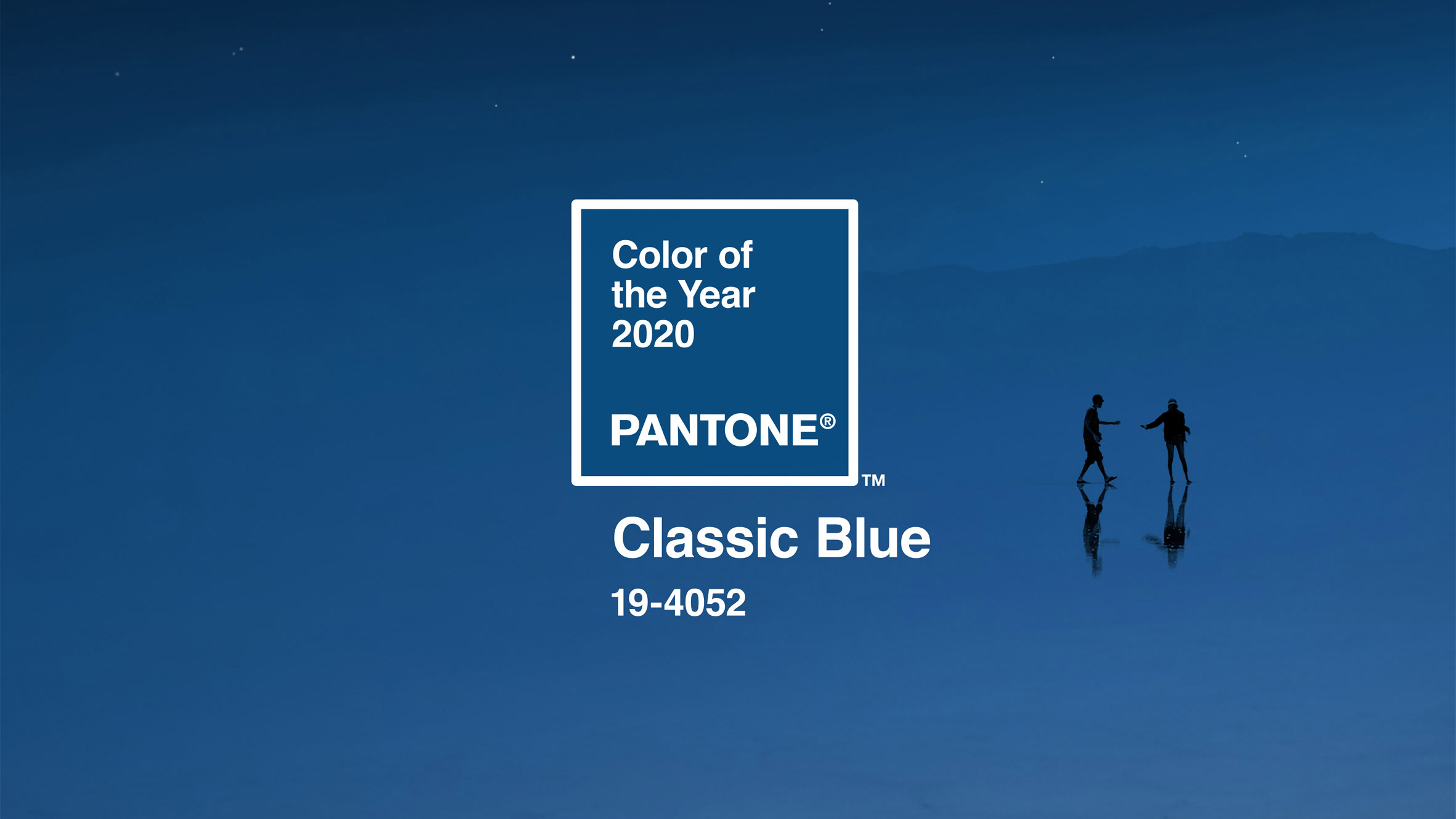
Each year Pantone selects it’s ‘Colour of the Year’, they base their decision on trend forecasting and this year they have chosen Classic Blue.
There has been some debate as to whether this should have been named colour of the year, with so many other trendsetters being more in favour of green. Going by what has been seen at trade shows over the last two years green has definitely been the more dominant colour.
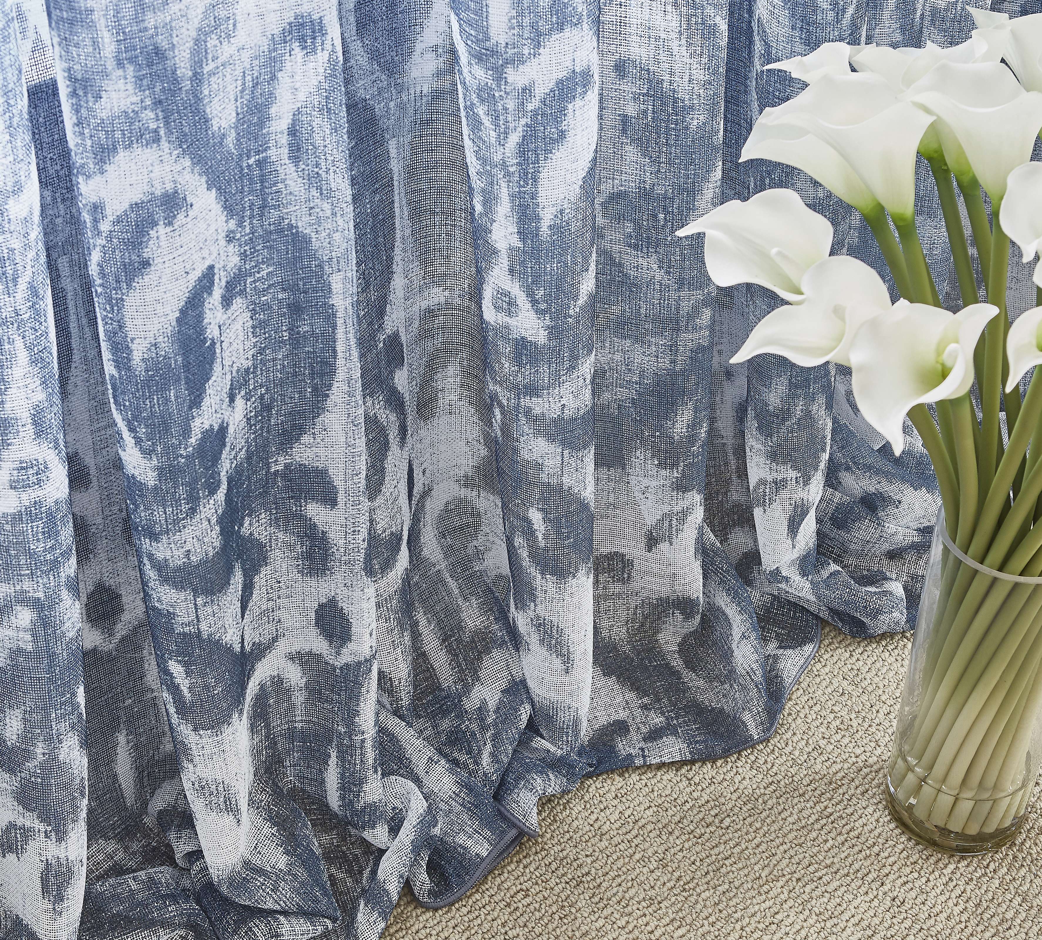
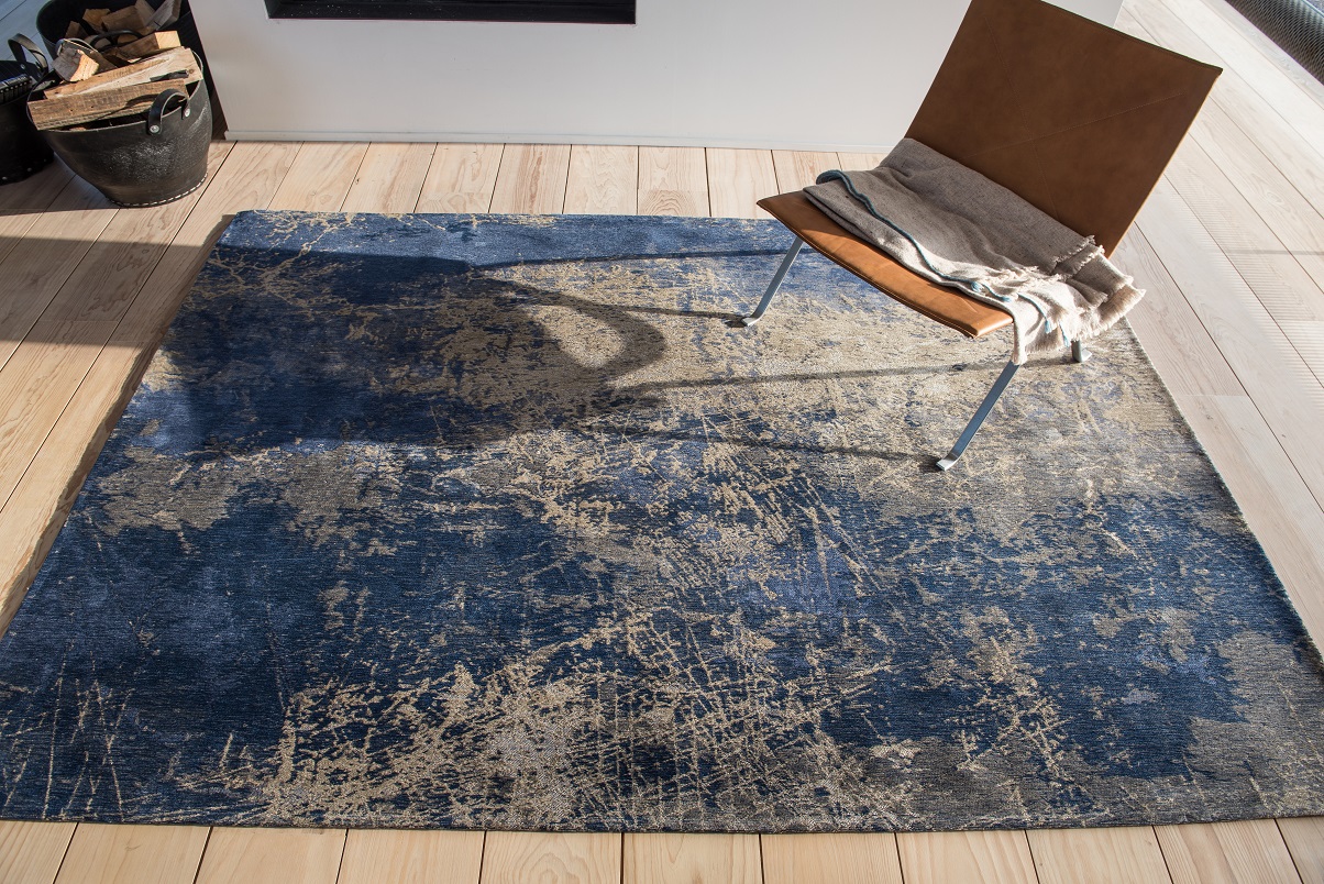
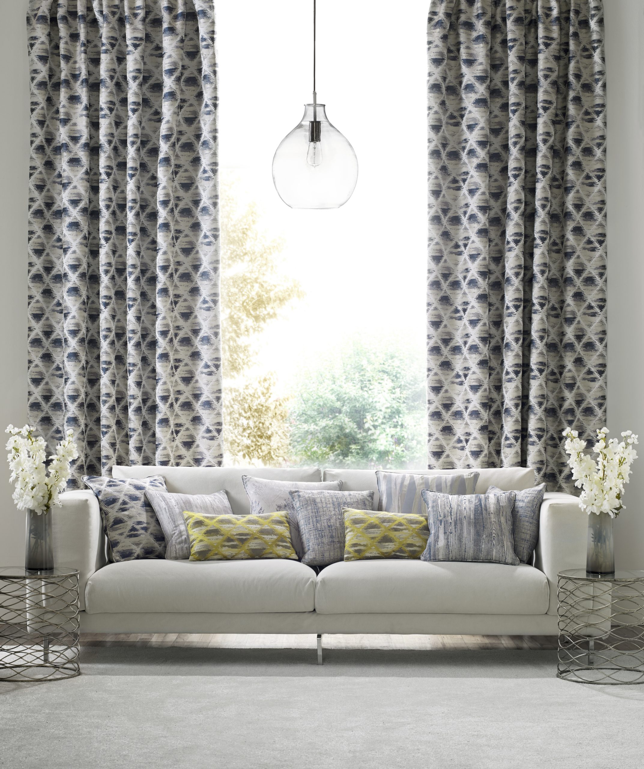
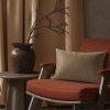
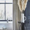
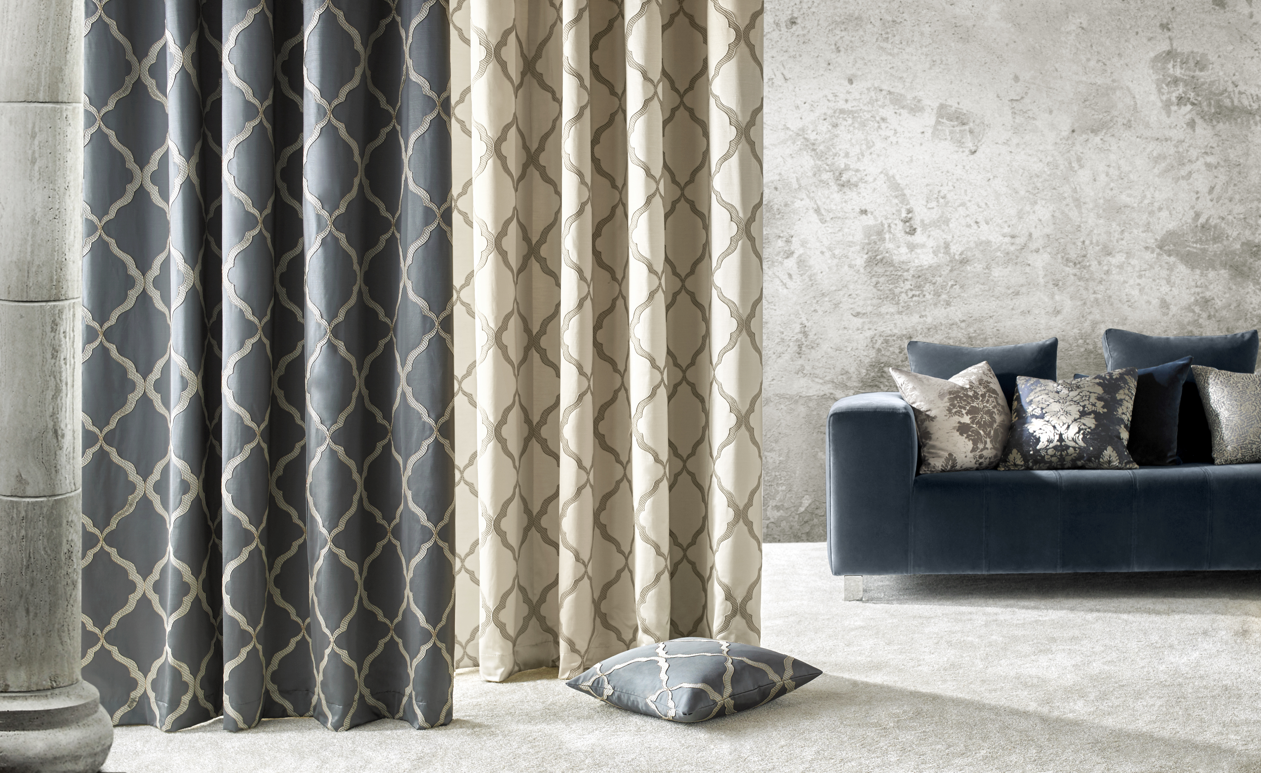
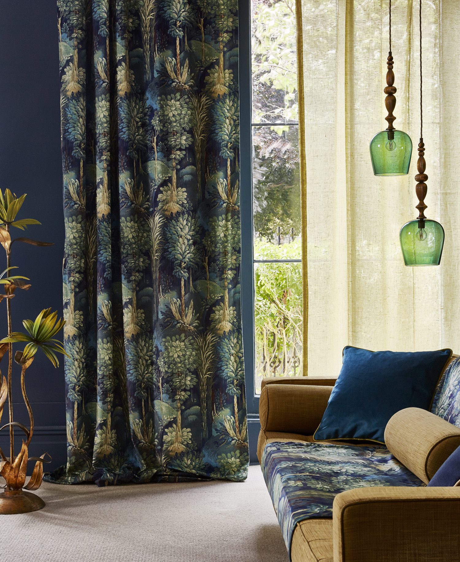
However, from my experience over the last year blue was a much bigger colour for our customers. People are stepping away from plain colours on curtains, blinds, walls, and rugs, braving bolder colours and designs. All shades proved popular with my customers, with varying degrees of pattern, some subtle, some much, much bigger and brighter. Ranging from soft baby blues to rich midnight blue with geometric, floral, and textured designs.
So why has blue been such a good colour for the home? There are many benefits to the colour blue, it is the colour that evokes serenity, it is known to be able to reduce stress, calm breathing and decrease your heart rate, something everyone needs after a hard day at work. It is the colour of security and trust, again something very beneficial for your wellbeing in your home. Blue works well in living rooms as it creates a feeling of calm, but if you choose to use blue be mindful of the shade as they can become cold and you don’t want to be left ‘feeling blue’. Blue is also a great colour for a study or home office as it has been found to increase productivity. Blues are useful if you want to create a nautical feel, there is an obvious link to blue and water, use it in a simple stripe on curtains, blinds, cushions or even on carpet.
If you are looking for more advise come in and ask the experts at Fashion Flooring and Interiors. We can talk you through the various options, we will carry out a site survey, take measurements, and then provide you with a quotation free of charge. See the advert below for store details.